Originally published in Technical Communication, 1978 - Vol. 25, No. 1.
UNJUSTIFIED TYPE carries an unjustified reputation with some people: it is seen as nothing better than mere typewritten copy; really professional work should be “blocked out,” justified. Professor Rehe argues convincingly that such a view is the product of closed minds, and he shows that there are significant advantages to leaving the right edge ragged.
“Typography must be legible,” many a designer sates. Most experts in graphic arts agree. But there is perhaps equal agreement that most applied typography is not as legible as it could be, as it must be.
What is the problem?
Not one. Several! One often overlooked, however, is that in many of our approaches to typography we are too much locked in petrified traditions. Old printer sayings such as “When in doubt use Baskerville,” or "Type is legible when it fills the slug,” or “Follow the copy even when it goes out the window" still direct too many typographic decisions.
Nonsense!
Lets focus on that old cliché, “Blocked out (justified) type is beautiful.”
By justified typesetting we mean the method in which all lines are brought to a predetermined, uniform width by either reducing or increasing (that is, justifying) spaces between words and, as needed, by using end-of-line hyphens (that is syllabicating).
But why do we even have justified typography?
We have to go back to pre-Gutenberg times to find the answers. Early scribes who produced books during the Fourteenth Century wrote their Fraktur1 lines in unjustified style. But succeeding monk-scribes, at some obscure point in history, must have decided that blocked-out, justified lines were better.
In the middle of the Fifteenth Century, when Gutenberg produced his first books in movable type, he justified all of his lines. He simply copied, as we know, the lettering style of the scribes.
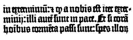
There is no doubt that Gutenberg's books are beautiful. When we look at the individual justified lines, we find their word spaces to be almost miraculously uniform. But further analysis shows that Gutenberg used several hundred ligatures and liberally contracted words (contractions were symbolized by horizontal bars over letters) to obtain that almost perfect equality of word spacing. (Figure 1 shows an example).
Figure 1—Lines from the 42-line Gutenberg Bible. The miraculously even word space was achieved through numerous ligatures and liberal contractions (marked by horizontal bar over the letters).
But was all this rigid beauty, all this elaborate, detailed word spacing necessary?
Although there is universal agreement that the cradle prints, the incunabula, are perhaps the most beautiful books ever printed the question must be asked, was this style functional?
Before we answer that question, we must preface it by asking, did books need to be functional at that time?
They did not! In Gutenberg's time, only a very small segment of the populace knew how to read and write. And although Marshall McLuhan, doomsday prophet of the print medium, rightly calls Gutenberg's invention the first mass commodity it was that only in a limited sense because of the small number of people who could read and write. Most of the literates then were theologians in monasteries. They had ample time and leisure to read and practice the art of writing.
Now, let’s look at today’s world.
An information revolution has occurred, which was made possible by a revolution in communication technology, especially in the graphic arts. It is purposeless to ask whether the technological revolution caused the information revolution or vice versa, just as it is purposeless (except perhaps at a Toastmasters’ Table Topics session) to ask which came first, the chicken or the egg?
In our daily lives, we all are confronted with more print information than we can actually absorb, that is read. There are several possible remedies to this impossible situation, but two come to mind immediately:
To help readers comprehend more easily, writers have to improve their writing style. We call this improving the readability of information (as opposed to the legibility of information, which is strictly a matter of visual perception). To help readers increase their reading speed, production editors - as well as layout artists, typesetters, and printers - have to improve the typographic legibility of the writers’ messages. We call this improving the visual comprehension of word shapes and individual letters (the legibility).2
In technical communications, much has been done about bettering the style of writing. Scant attention, however, has been given to making typography more functional.
It happens that the information revolution had been accompanied by a revolution in the technology of typesetting methods. Today's phototypesetting methods, for example, enable us do things with type and typography that could not be done before, at least not economically.
Typography, however, has always been a terrified prisoner of tradition and of the limited technological methods of the past.
The invention of the Hoe Type Revolving Printing Press in the mid-1800s represents one striking example of how technical methods influenced and imprisoned typography for years (Figure 2).
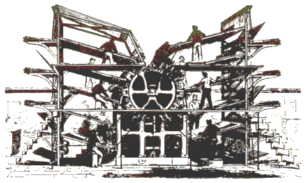
Figure 2—The Hoe Type Revolving Printing Press. Type forms were locked onto the curved cylinder and held in place with the help of wedge-shaped strips of metal between the columns (column rules).
The press in itself was quite an advancement in printing technology, because it could produce printing at a much faster speed than ever before. But the construction of the machine made it necessary to have the type forms curved around the impression cylinder. Assuredly, it was quite an undertaking to keep those type forms locked onto the cylinder. To achieve that goal, wedge-shaped column rues (strips of metal) had to be inserted between the metal columns of type. This severe typographic restriction (column rules) lingered on as “a typographic style,” especially in newspaper printing, long after the type forms on the cylinder had been replaced by stereotype-cast type forms, and later by offset printing.
Then there were restrictions that came with the galley sizes, the width of the Linotype slug, the spacing materials (slugs and reglets), and a number of other variables. They made it impossible to go beyond the set boundaries of a typography which had not changed drastically in hundreds of years.
The Bauhaus designers of Germany3 were the first ones to look at this impossible situation and to recognize it as such. Their motto was “form follows function.” Although their typography of the early 1920s and '30s looks rather obscure and old-fashioned today, it nevertheless set in motion a reassessment of typography and in turn brought about greater functionalism in print communications.
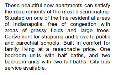
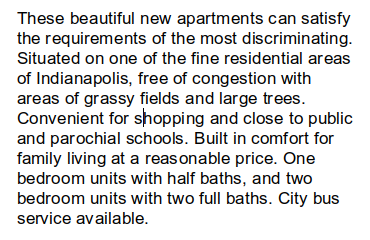
It is uncertain and of little importance to know who first started setting type in an unjustified measure. All we know is that it took many more years—not until sometime after World War II—for typographers and designers to begin to look dubiously at the blocked-out style of typesetting illustrated in Figure 3.
Let's take a moment to define unjustified typography in more detail. Basically, it means any text typesetting that is not blocked out, that is, not justified by increasing or decreasing the white space between words. However, the most effective unjustified typesetting is flush left and ragged right (Figures 4 and 5). It must be flush left for maximum legibility because the eye needs the imaginary vertical line, formed by the flush-left text, on the left. This reference line, of course, is not necessary at the right, where the eye simply stops. At the end of the line the eye rotates back to the left of the text block and starts reading again at that reference line. This is a very important point to remember.
It is for lack of that reference line that flush-right ragged-left typesetting makes for poor legibility (Figure 6). It slows down the eye, which has to search for the starting point again and again, because the beginning of each successive line of text may shift more to the left or to the right. This necessary searching and readjusting also tires the eye easily.
Equally hampering to legibility is the so called ragged-left/ragged-right or centered approach (Figure 7). Once again the important reference line on the left is missing, forcing the eye to search for the beginning of each successive line.
Therefore, in the context of our discussion we will define desirable unjustified typesetting as flush left and ragged right. This style, it is my contention, is more legible than blocked-out (justified) type or any other version of typographic arrangement.
Before I present my case, I should point out that quite a number of studies have tested the legibility of unjustified versus justified type (Davenport/Smith, Fabrizio et al, Gregory/Poulton, Hartley/Burnbill, and Wiggins).4 Practically all studies found no significant difference in legibility between the two typesetting styles.
Let me now give you my reasons for considering unjustified style more legible (I am confident that empirical proof will be forthcoming eventually).
To begin with, we reduce the number of end-of-line hyphens. This is not to say that all such hyphens should be eliminated. But they definitely will be reduced. We can, however, eliminate all end-of-line hyphenation by accepting an unjustified style of frequent very long lines and very short lines. If we desire such total unhyphenated typesetting, the copy has to be marked with that instruction before it goes to the typesetter.
I prefer an unjustified typesetting style in which the lines are of fairly equal width. Before sending my copy to the typesetter, I mark it, “Please make lines fairly full”.
In addition to reducing or eliminating end-of-line hyphens, we realize another important gain in legibility: all the word spacing is equal. In justified typesetting we have to either reduce or increase word spaces to block out the lines. Often we end up with an assortment of very narrow of very wide word spaces. In unjustified typesetting, that process is not necessary. With no doubt, the eye is more comfortable reading text having uniform word spacing than it is reading text having varying word spaces.
Unjustified typesetting should make the job easier for the typesetter, at least in metal typesetting. In fact, one study conducted in Holland5 has shown that when the newspaper Rotterdamsch Nieuwsblad changed to unjustified typography, the typesetting time for the Linotype was reduced by 13 percent.
Now, I'll hasten to say that this saving of production time applies only to metal typesetting. In computerized phototypesetting. it doesn’t make much difference whether the type is unjustified or not, because justification is a fully automatic process anyhow. The same holds true for most strike-on composition.
It is an important differentiation to make.
Several years ago I spoke to a group of business communicators in Indianapolis. In pointing out the advantages of unjustified typography, I mentioned that study from Holland which had shown the reduction in production time and emphasized that production savings accrue from unjustified typesestting.
Well, the next time I saw one of my favorite typesetters, he was rather irritated. He told me that within a few days after my speech, quite a number of business communicators had come into his shop and insisted that from then on their typesetting was to be done unjustified. With equal fervor, they demanded that he reduce their typesetting costs.
My typographer friend, however, did most of his production in phototypesetting, not in metal typesetting. With good reason, he requested that when I spoke to this group again, I should make clear that the savings in production time and costs occur only with metal typesetting. I certainly heeded his advice.
Reducing or eliminating line-end hyphens does, however, help the computer in the phototypesetting process. Computers have difficulties hyphenating correctly because of limited memories and because of extensive syllabication problems inherent in the English language. But by decreasing or eliminating end-of-line hyphens, we reduce or avoid hyphenating errors.
With the unjustified style, the typesetter and the page-makeup editor quite often can handle corrections with little bother. A particular deletion made by the proofreader, editor, or author may mean nothing more than resetting one line a little shorter. No problem. Conversely, a particular addition may mean nothing more than resetting one line a little longer (but within the column width). Again, no problem. The preceding is not always true, of course. It depends on the extent of the corrections. However, the need to reset an entire large text block—a nuisance characteristic of justified typesetting—is rare.
Whenever I advocate unjustified typography (and I do it almost religiously: in fact, for my own graphic designs I use unjustified typography exclusively), one of the first questions usually asked is, ‘Doesn't unjustified type take up more space than blocked-out type?'
For all practical purposes, it does not. Most of the time we actually break the lines at the same points that justified typesetting breaks them. We simply don’t expand the spacing between words to fill out the short lines, and we don't tighten the word spacing to make too-long lines fit. Incidentally, the newspaper study in Holland, mentioned earlier, verifies that point: the changeover to unjustified typesetting did not require more space for the same amount of text.
With the unjustified style, column width should perhaps be one-half pica wider. Since most lines in unjustified will not fill out the width completely, more white space appears between the columns. So white space between columns may be reduced to. Use your own judgment. Simply make sure there is not too much unnecessary white space between columns.
When we look back in history, we find that in the mid-1800s, printing techniques had reached a point where printing output was growing very quickly. The increased output was due to necessity. As the United States became more widely settled, more information needed to be communicated. Consequently, this country saw feverish attempts by many would-be inventors to come up with an effective typesetting machine.
Eventually, in 1884-1885, Ottmar Mersgenthaler invented his Linotype machine. One of the main technical problems plaguing those early inventors was the need to justify each line of type but maintain at least a semblance of equal word spacing. Mergenthaler solved the problem by devising the spaceband, metal wedges that expand equally when pushed upward between the words in the line of type. On any given line, therefore, these spacebands maintain equal word spacing on that line and in so doing, they justify the line. But, of course, how much the spacebands expand or contract can vary considerably from one line to the next.
Looking back, we can see the irony of it all: had we not had this preoccupation with justified composition, we could have had effective typesetting machines much earlier.
The typographic styles of any period reflect—as does visual communication in general—the mores of that period. They indeed must do so. I think this point is very well illustrated in justified composition. It reflects the rigid, very moralistic, rather inflexible mores of the Middle Ages, which gave birth to the style. And I think today’s unjustified, freefloating, unenforced typography reflects the relaxed, flexible, and free spirit of our time.
When you work with the typesetter, however, there is a practical point to consider. Many of the older typesetters are so conditioned, so used to blocked-out justified typography, that they find it difficult to switch to unjustified typesetting. I am sure I have caused many old typesetters to become completely baldheaded or grayhaired before their time when I insisted on unjustified typography; then upon receiving proofs that were partly justified, sent them back with the request that the typographer reset the copy. We all are creatures of habit, and typesetters surely are, too, at least many of them.
For some reason, not all typesetters understand what I want when I order unjustified type. Without fail, I will receive some type having varied wordspacing, either reduced or enlarged; some having very bad line breaks; or some having lines either extremely short or extremely long, even though I marked the copy very clearly with “Please make lines fairly full.”
Working with a redesign project of one newspaper some time back and, of course, advocating unjustified typesetting for the text, I found the editor seemingly sympathetic to my request. However, a few days later the composing room superintendent flatly told him—and the editor, in turn, me—that unjustified typesetting could not be done without great difficulties.
Unjustified typesetting is appearing in an ever-increasing number of newspapers. Even the venerable New York Times—with a front page typography that is pure Nineteenth Century—applies unjustified typography, seemingly on an experimental basis, for selected pages. It looks good!
Training the typesetter to set unjustified type properly may indeed, in some instances, take time. Many commercial typesetter—perhaps most of them—do a good job. But if you experience poor results from a particular typesetter, simply consider them growing pains. If the growing pains don't subside, change your typesetter.
Unjustified typesetting is here to stay. It's an idea whose time has come; in fact, it's an idea whose time has long been overdue.
I predict that within the next decade unjustified typesetting will be the style of the day.
It will make the typography of your print communications as effective, as legible, as functional, as they must be in today's world. And perhaps when our children and grandchildren look back at some of the justified typography of their yesteryear, they'll smile in bewilderment and say, “Why in the world would they set type this way?”
Because it was a tradition nobody questioned.
That's why.
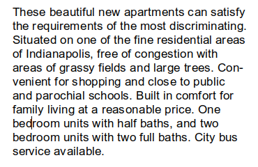
|
| Figure 3—Type set in the traditional justified (blocked-out) style. |
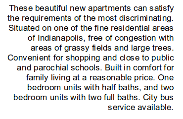
|
| Figure 4—The same paragraph, same column width, but unjustified and without end-of-line hyphens. |
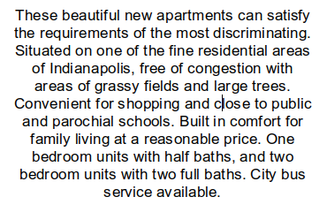
|
| Figure 5—The same paragraph and type face, with hyphenation. Word spacing is even; the number of lines is the same as in the original justified version. |
|
| Figure 6—Type set "flush right, ragged left". Of reduced legibility because a vertical reference line (actually, an imaginary line formed by a flush-left text) is missing. The eye has to search for the beginning of each new line. |
|
| Figure 7—Type set “ragged right and left” (centered). Again of reduced legibility because the vertical reference line on the left is missing. |
| |
| HTML paragraph, traditional (left and right-justified). | |
| |
| HTML paragraph, default (left-justified). |
A LibreOffice (6.4) generated pdf file with two pages, one in each justification style.
1. The term Fraktur, fom the Latin for “broken" denotes letterforms that were not written in one continuous stoke of the pen, but rather required stopping the pen, lifting it up, and starting again. In other words, the pen stroke was not continuous, but broken.
2. In this context, legibility refers to text type. In a larger context, however. legibility concerns itself with all typographic communication.
3. A school of design established in Germany in 1919 by Waller Gopius. Nazi hostility closed it 1933, and brought many of the faculty members to the United States. From Bauhaus came the first regular application of sans serif type.
4. For more detailed information on the studies and unjustified typesetting see R. Rehe, Typography: How To Make It Most Legible, 2nd rev. ed. (Carmel, Ind.: Design Research International. 1976). pp 33-35.
5. Evers, C.H. "Adjustment to Unjustified Composition on the Rotterdamsch Nieuwsblad." Journal of Typographic Research, I (Winter, 1968) 59-74
ROLF F. REHE serves as Assistant Professor for Typography at the Herron School of Art Indiana / Purdue Universi in Indianapolis. He also heads his own design studio, Design Research International, specializing in typographic design, research, and consultation.
A frequent contributor of articles to both American and European professional journals, he is also the author of Typography: How To Make It Most Legible. He has attended the New School for Social Research, New York; Herron School of Art; Purdue University; and Indiana University, where he earned his B.A. in Psychology and M.A. in Journalism and Graphic Design.
He lectures extensively here in the United States and abroad. An award-winning designer, he holds membership in the Association Typographique Internationale, the Society for Typographic Arts, and the International Center for the Typographic Arts.